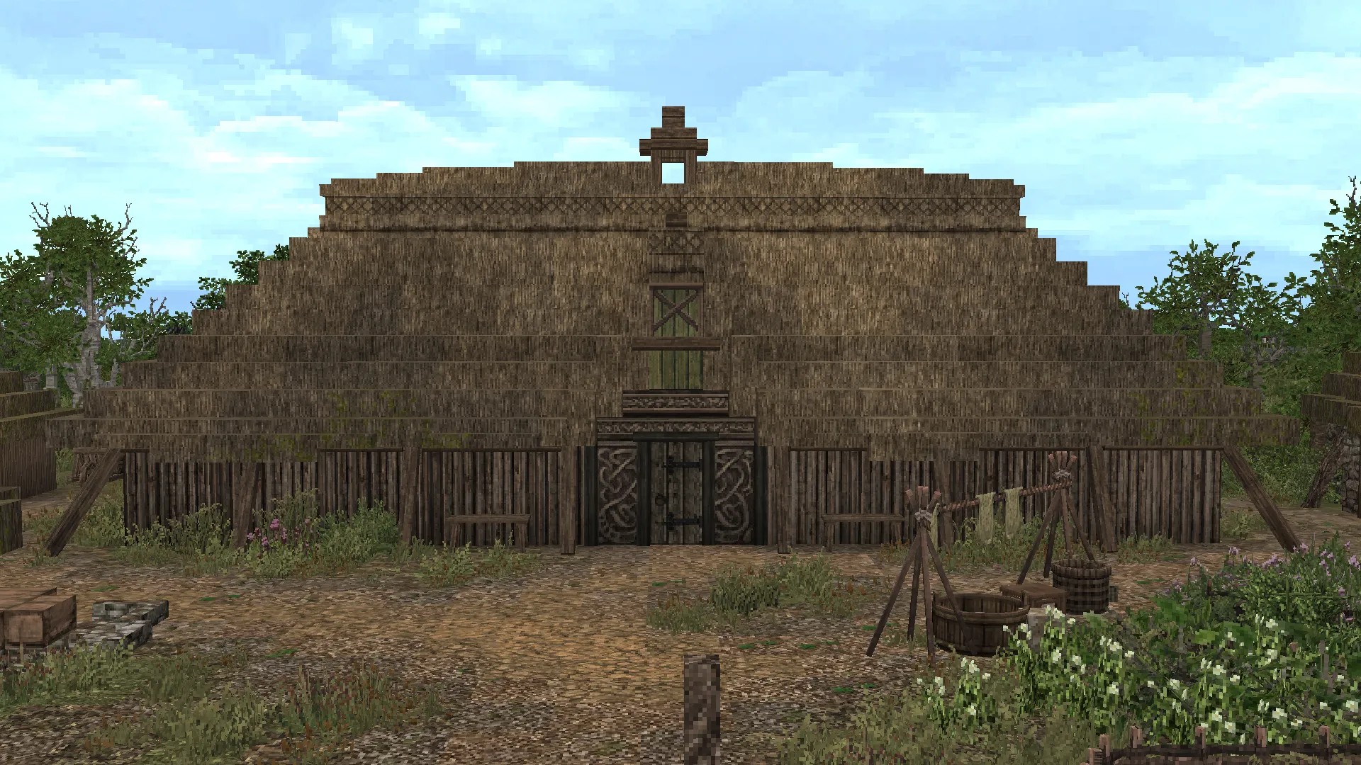
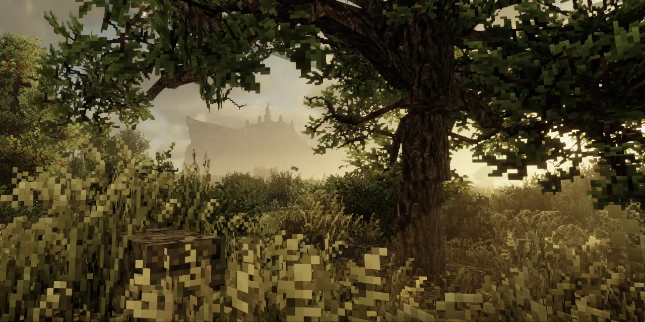
Overview
Gradients, blending, texturing or transitioning all refer to the same basic concept. It is a process in which one value (or tone) is transitioned to another from A -> B -> C. In drawing, this can be thought of as shading, in painting as blending, or in pixel art as dithering. No matter the medium, the goal is always to tidily transition between light and dark details to create a harmonious effect. In Minecraft we refer to this as gradienting, and it is achieved by mixing a number of blocks in a sequential order to create a seamless and tidy blend.
While the concept of blending blocks together seems simple enough, in practice it can be difficult to master. The most common way in which beginners mess up a gradient is by missing a step in the transition that could blend the blocks more thoroughly. Nothing ruins the illusion of a realistic surface quicker than noticeable blocky squares due to a poorly blended palette. Our aim is instead to create smooth and visually appealing texturing.

Palettes
When choosing your palette, there are three properties to look out for. The first is value - how light or dark the block is. This is by far the most important. Second is colour. Third is texture. It's not always possible to have each block match perfectly but generally if the value and colour and/or texture is near enough then it will work.

Conquest features many connected textures (CTMs), wherein each block has a series of variations that repeat themselves depending on how large the texture is. This is a great feature which alleviates the need for excessive gradients and blending since textures will already do some of the lifting for you (depending on the texture of course). However, it can also create trouble when you choose a palette and find out that a connected texture has variations that no longer blend so nicely as you had expected. Below is an example.

With that it mind, it's important to consider this when applying your gradients. The two blocks listed in the above image are notorious when it comes to CTM interference, as they each have significant variations in light and dark spots. Looking at the example on the right, take notice of that dark horizontal line you see at the top-left. Or alternatively, the example on the left clearly has a lighter rock texture at the edges of where it touches the brick. These are determined by coordinates, so unfortunately sometimes you will simply get unlucky if you want a precise gradient patch. Your options there are, as always, to adjust and move things around until things work out better.
Patterns
An appealing pattern serves as the foundation of any good gradient. This 'pattern' refers to the effect that some kind of weathering has on a surface, such as the drip of water, darkening of corners or patches on a wall. There are different patterns that will work in different contexts, and at times it may help to use more than one.
Typically, the most common pattern is a kind of cluster that will vary randomly in a blob-like shape across a larger surface. These clusters usually represent where there is damage or decay on a surface, but also serve as the main interest-driver in your gradient. It involves a combination of realism (which parts of your surface are weathered) and design decisions.
To begin, it's perhaps easier to examine what not to do.

Not good! You could consider this a pattern, but it's not a good one. We're aiming to avoid splattering and introduce a more structured pattern instead.
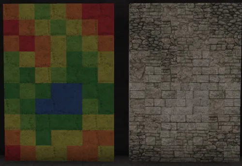
This is a much better attempt, but there is a lot of room for improvement. The obvious first error is that steps in the gradient are skipped; red is touching yellow, yellow is touching dark green etc. There are rare exceptions to where you may want to skip some steps in your palette, such as when your block choices are very similar, or CTM interference, but generally it's best practice to stick to your palette order. The other error is that of the pattern design itself. The clusters are suitably sized, but their shapes are jarring, such as the top left which awkwardly runs down at a 45 degree angle. When structuring your patterns it always helps to squint your eyes to notice dominant shapes and adjust accordingly.
As noted earlier, CTM's will sometimes give you trouble and produce weird dark or light splotches where you don't want them. Take care to notice these.

Accounting for the previous errors, we have a satisfactory gradient. The pattern shapes are tidied up and don't look jarring from afar, and the gradient structure is kept in place. On the left I also decided to add warm light limestone cobble to help blend light limestone cobble and light limestone in places where the CTM's create harsh edges.
This is of course a generic flat wall, going larger will call for a more detailed pattern structure, maybe there are spots near the middle that are also discoloured and so on.
Process
Before creating a gradient, it's often a good idea to begin with a blank template - wool/canvas blocks are a good option. The reasoning behind this is that it's much simpler to focus on one element of your build at a time. Moreover, gradienting can be an arduous process and it's helpful to settle on your general shape before committing your time in finalising the texture. Remember that the gradient is just the final step in the building process, and a great gradient can't save a wonky and half-baked structure!
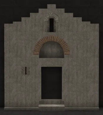
Basic canvas shape
So to begin, we have a simple canvas template of the building (a simple Byzantine chapel in this case), with the main architectural details added. This is effectively where the most thought and work is put in; proportions, door and window designs, etc are figured out here.
It's important to think about your steps down the line when it comes to adding a gradient. An over-detailed surface with too much depth and detailing will be very difficult to adequately gradient. Depending on how much detail you choose to add to your template will dictate how detailed your gradient will be. A highly detailed canvas template will call for a simpler gradient, and likewise a simple surface can be elevated by a more intricate gradient. Or not! Surroundings matter, and it's valuable to be aware of what's around your building to accommodate a cohesive level of detail that balances out your overall area. If house A that you have already completed is quite complex, perhaps house B next to it can benefit from less detail and give some room to breathe. Cohesion is more important than pretty but disjointed individual components.
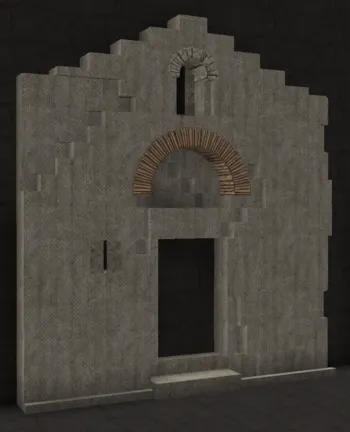
Canvas detailing
Once the basic canvas shape is in, then it's time to start thinking about weathering. Textures consisting of stone, wood, plaster etc. can often benefit from cracks to help show age. Cracks and chipped material works well in the corners of the building, in areas around wall openings such as windows and doors, and in areas that connect different wall angles (the corner of two buildings for example). The placement of these cracks shouldn't be random but intentional where it makes sense for them to appear. It's easy to overdo this and create a highly damaged building, so add it tastefully to enhance the shape. Bear in mind while doing this that the cracked areas will be your most damaged - this means these are often the darkest stained parts of your building! Some forethought of your gradient design in this stage will help a lot, but this comes with experience. Sometimes it's simply a back and forth process of adding cracks and gradient stains interchangeably to get a satisfying end product.
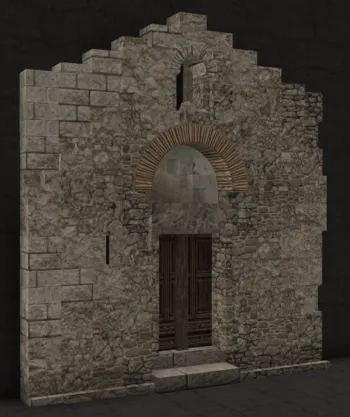
Adding in your gradient
The final step is to replace your canvas template with your actual gradient. Before doing this however, it's worth setting out your palette before applying it to your building. The size of your palette will depend on the size of your structure. Too many blocks in your palette will end up in an excessively detailed gradient (even if you can transition them all smoothly), and too little will look bland. Find a balance that you feel is appropriate and then blend it into your building. Remember that your gradient should follow what you've done with the cracks, and if you need to make any adjustments then move the cracks into positions that compliment your gradient. It's also not uncommon that, upon adding a gradient, you realise the shape of your building and/or cracks are excessive and make for a messy final build, so sometimes it's also necessary to move things around to strike a good balance. You're effectively painting a canvas in this step, so it's important to spend enough time until you get a good result since this is the final polish of your build.
Addendum: ArdaCraft now has a paintbrush feature for gradients. To find it, search 'paintbrush' in your inventory. Equip it in your hand, and left click on the block you would like to palette your canvas with. Then, simply right-click and your chosen block will be applied to whatever blockstate (if it is compatible) you'd like. You can also adjust the paintbrush size to your liking, by holding ctrl and scrolling up or down on your mouse wheel.
This is essentially the tool we now use for all gradients, as it makes your life infinitely easier in the canvas>gradient stage!
Conclusion & Gallery
At this point, you more or less have all the necessary knowledge to produce good looking gradients. I've put into words the most important things that run through my mind during the gradienting process, though it becomes subconscious very quickly. Much like anything, time and practice will develop your eye for what works and what doesn't. This guide is intended to get you started, but it won't help you at all unless you put in the practice. With that, happy gradienting!
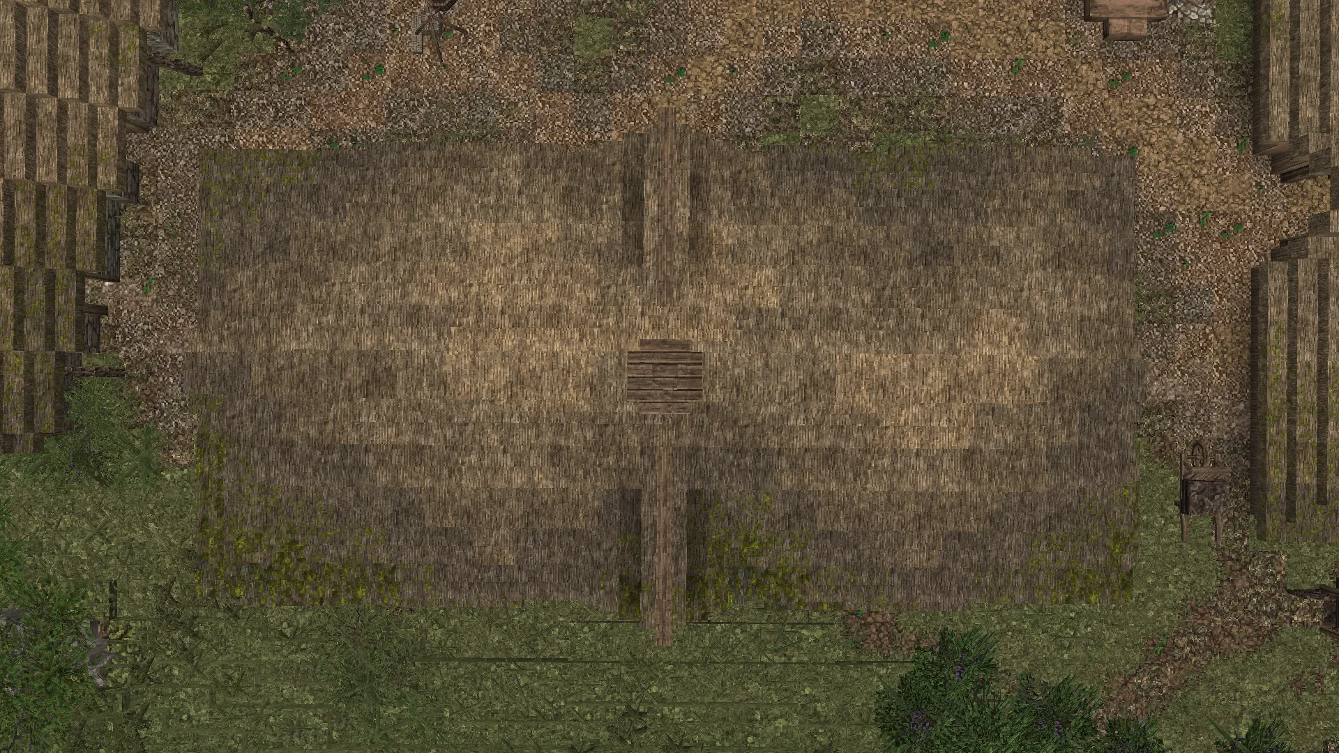
Below is a gallery of gradients that I would consider very well made. Feel free to copy and implement whatever you like in your own builds. There's also some variation on subject-matter to satisfy the interest in differing applications.
.webp)
.webp)
.webp)
.webp)
